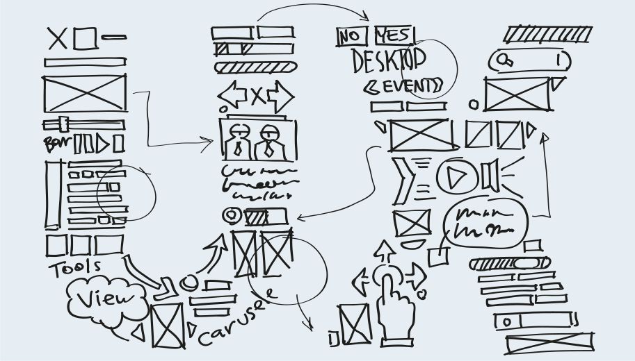
Designing the UX way
Hiding complexity or at the very least making what is complex more understandable is a cornerstone of good User Experience (UX). Lidia Oshlyansky, Head of User Experience, Schibsted Products and Technology, shares the striving for achieving simplicity.
The links between perceived usability, beauty and simplicity have been made by researchers for many years now. Before user experience became a profession and human-computer interaction became a field of study, other areas, such as psychology, were already looking at how object placement, object relationships and similarity could affect our perceptions. For example, Gestalt principles speak of how we try to simplify complexity by using cues such as proximity, continuity, similarity, closure, figure and ground.
Beyond psychology we have learned and borrowed from many other disciplines, as well as growing a field of study and practice, to help us create user experiences that are simple, beautiful, engaging, usable, useful and maybe even a little fun.
Researching and testing
That’s all well and good you say, but how do you actually do it? It’s not magic; by researching and testing our ideas early and often and from there iterating our designs we aim to hit the sweet spot of user experience for our audience.
To give a concrete example, we’ve been developing a reporting tool for our Ad Operations teams. They have current tools in place. These tools are fairly difficult to master, often don’t work as well as we’d like (it can take hours to produce a single report) and are often more complex than they need to be for their most common use.
We set out to try to address this issue for our end users. We first went to see how their existing tools worked and what types of reports were most often produced. From this research we developed some ideas for a minimum viable product – one that would address the most common use of the reporting tool.
We quickly prototyped this tool and took it back to the users to test. We listened to their feedback and requests. We quickly fixed anything we could. Requested features that would take longer to develop were added to our to do lists for future releases or iterations of the tool.
We gave the tool to users so that they could use it in their day to day work while we continued to add features and changes from our to do list.
Once we had made enough changes to make the tool even better we went back to the users again to test and see how the newest additions to the reporting tool were working for them. We again gathered their feedback and requests so we could make any quick changes or needed fixes and again create a new to do list for anything that would require more time to address.
A product suited for purpose
In this way we’re able to create a product that is simple and right for the users. They provide us the much needed input on their needs, goals and the problems they would like to have us solve. They also help us understand how they will use our products in their day to day work. We in turn can design and engineer for those needs. What happens as an end result is a product that is suited for purpose, simple to use and even increases productivity (no more waiting an hour for a report).
External users
The process described is used whether you design for an internal or external users. With external users things like our branding become more paramount and the styling, visual design and of course communication style must be closely aligned across the product. Of course, internal tools should be wonderful to use, but external tools may depend on their user experience being truly wonderful to be commercially successful. In the case of designing for external users things like engagement and the user’s emotional response to the product become even more critical.
